When I first started looking for a style I began with the site below that helped me a lot when trying to figure out how to get started on digital art thinking about colour, composition and overall design. This site took me through step by step on getting from point A to B through thumb nailing this is a stage I completely forgot about as I go straight into creating art and struggle through it till I’m happy with the outcome (Enough).
This website walks you through the template they have already made for you and the purpose is to be as loose as you want and to not spend too much time on each one. This technique really helped me as I am a perfectionist I found it difficult at first to just let loose and not worry about the details till later. Reflecting back I’m happy I decided to take this route as it has opened my mind and I feel like I was able to create better compositions through this technique and also I challenged my fear of using references to which I’ve been harbouring since I left High School.
*The pieces I used to help with my composition will be linked below as they did inspire my art I want to give recognition to the photographers that took the photographs and a big thanks as I am unable to travel to such places I am grateful that they have shared their adventures with the rest of us.
http://www.evenant.com/design/painting-environments-in-no-time/
Before I get into this I want to explain the pieces below this were pieces I tried to do before the help of this site, they are vary basic and I honestly hate them but I feel it shows development


I loved the limit to the values you were allowed to use which reminds me of my first year class on warm and cold greys to which Conann explained how light will affect both in different ways through warm and cold light, to which I’ve never thought of before (Light in general). I found this class extremely helpful through the year as I’m not just haplessly creating art I’m actually reflecting on what I’m doing and how each element affects the other.
” A quick tip: The sky is the brightest thing in a painting often, so I reserve the white for the sky, and for eventual water reflections, and the nearer something is, the darker it usually gets, so the black is mostly reserved for nearer things.”
This tip is something I have thought about regularly in the phase of creating both black/white and colour pieces, I hope I have applied what I’ve learned correctly to each piece.
Next was to think about composition to which I’ve researched previously https://shannonmurrayuu.wordpress.com/2018/12/18/personal-project-composition-research/ this helped through this next stage but also the help of the images below helped me as well which I’ve annotated to show my thought process.

Again these images are not mine they inspired the art below and they can also be found on Pinterest under island photography if anyone is interested in any of the images above.
This in turn helped me create the line art below-
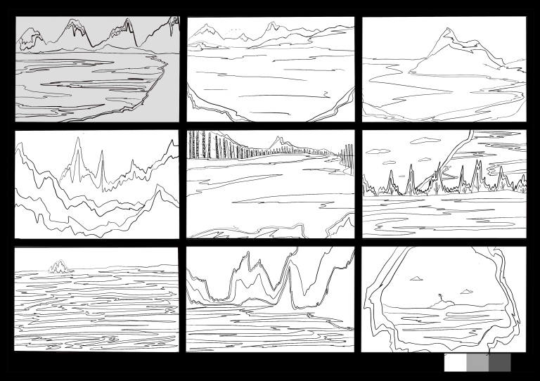
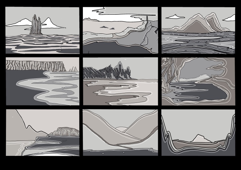
As I was happy with what I had produced thus far I decided to continue on with tonal work-

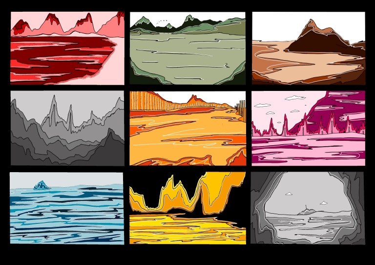
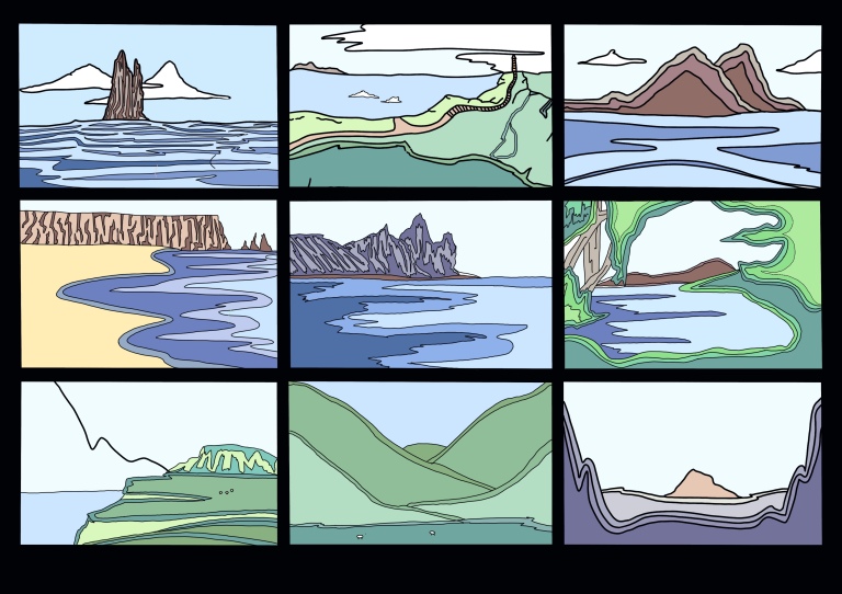
After this I continued on with colour-
For reference of the style I tried to produce I will be creating a separate blog post as this will include artist research and method explanation.
This then lead to me doing 9 more of the island but from the perspective of living on both islands. As the islands look identical the overall shape won’t change that’s why there’s only one version on the areas within the island itself. (Or possibilities of what the island could holds.)
Reflecting back I’m glad I realised the mistakes I had made in the tonal pieces and corrected them while creating the colour pieces to which I’m sort of happy with thinking back they are kind of simple but they definitely helped me with the next stage.
For my next set I would like to try and use these colours together using the colour palettes below that I had used previous to this-


For examples I will be using this website-
https://blog.spoongraphics.co.uk/articles/35-scenic-landscape-illustrations-vibrant-colors
I love some of the pieces on this site made by different artists, a few examples of my favourites-


Next I took to more thumbnail designs which I’m quite happy about to be honest I used the same method as above.

Again all images can be found on Pinterest.
My version-
Colour version –
Colour Palette-

Reflecting back over my work I really liked these versions however I did find these to see a little more simplistic but as they are truely thumbnails I suppose that is the point in order to take the piece further. I not sure if I’ve made any of these correctly but I’ve tried my best.
I think if I keep practicing this technique I might get better, I hope to continue on through the year as I really enjoy this process a lot. I think what hindered my development was my simplicity towards shape. Reflecting back on the project I hope to improve upon this in the future.
